Choosing the perfect color palette for your home is one of the most impactful decisions in interior design. Colors set the tone for each space, influence your mood, and create a cohesive flow throughout your home. With so many options available, selecting the right palette can feel overwhelming. However, by following a thoughtful process, you can create a harmonious and visually appealing environment that reflects your personality and style.
Here’s a step-by-step guide to help you choose the perfect color palette for your home:
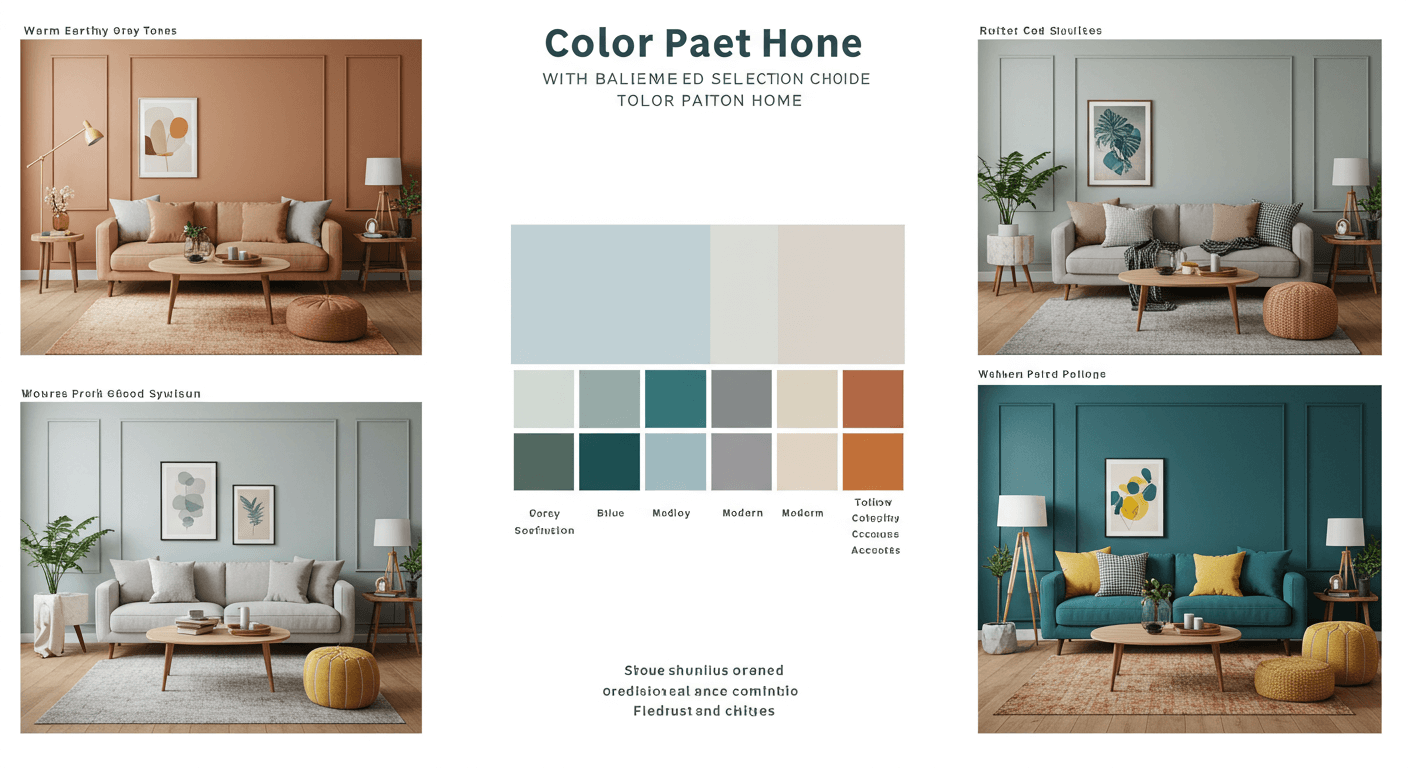
1. Understand the Basics of Color Theory
Before diving into specific colors, it helps to understand the fundamentals of color theory. The color wheel is a valuable tool that organizes colors into three categories:
- Primary Colors: Red, blue, and yellow.
- Secondary Colors: Green, orange, and purple (created by mixing primary colors).
- Tertiary Colors: Shades like teal and magenta, formed by blending primary and secondary colors.
Colors are also divided into warm (reds, oranges, yellows) and cool tones (blues, greens, purples). Warm tones evoke energy and vibrancy, while cool tones promote calmness and relaxation. Combining these tones strategically can create balance in your home.
2. Determine Your Style and Mood
Your home’s color palette should align with your personal style and the atmosphere you want to create. Ask yourself:
- Do you prefer modern, minimalist, traditional, or eclectic styles?
- What mood do you want each room to convey? For example, calming blues are ideal for bedrooms, while lively yellows work well in kitchens.
- Are you drawn to bold, dramatic hues or subtle, muted tones?
Identifying your preferences will narrow down your options and provide direction for your color choices.
3. Draw Inspiration from Your Surroundings
Inspiration can come from many sources:
- Nature: Earthy greens, ocean blues, and sandy neutrals mimic the natural world.
- Artwork: A favorite painting or photograph can serve as a starting point for your palette.
- Fabrics and Textiles: Look at rugs, curtains, or upholstery you love to find complementary colors.
- Travel: Colors from a memorable destination can bring a unique, personal touch to your home.
4. Start with a Neutral Base
Neutral colors like white, beige, gray, and taupe are timeless and versatile. They create a clean backdrop that allows accent colors to shine. A neutral base also helps smaller spaces feel larger and provides flexibility if you want to change decor elements in the future.
Consider painting walls in a neutral tone and using bold or vibrant colors for furniture, artwork, and accessories. This approach ensures that your space remains adaptable to evolving trends and personal tastes.
5. Choose a Dominant Color
The dominant color will anchor your space and set the overall tone. Typically, this color is used on walls or large furniture pieces. When selecting a dominant color, consider its psychological effects. For instance:
- Blue: Promotes tranquility and focus; ideal for bedrooms and offices.
- Yellow: Evokes happiness and energy; great for kitchens and dining areas.
- Green: Symbolizes balance and renewal; works well in living rooms and bathrooms.
- Gray: A sophisticated neutral that complements modern and classic styles.
6. Add Complementary and Accent Colors
Complementary colors are opposite each other on the color wheel, such as blue and orange or red and green. These pairings create a dynamic and visually striking contrast. Accent colors, on the other hand, are smaller doses of color used to enhance the dominant hue.
For example, if your dominant color is navy blue, you might choose warm orange throw pillows or gold accents to create a balanced, vibrant look. Using accent colors in artwork, cushions, or decor items adds depth and personality to your space.
7. Consider the 60-30-10 Rule
Interior designers often use the 60-30-10 rule to create balanced and visually appealing spaces:
- 60%: Dominant color (walls, large furniture, flooring).
- 30%: Secondary color (upholstery, curtains, rugs).
- 10%: Accent color (decor items, artwork, accessories).
This formula ensures that no single color overwhelms the space while maintaining visual interest.
8. Factor in Lighting
Lighting plays a crucial role in how colors appear in a room. Natural light, artificial light, and even the direction a room faces can influence how colors look.
- Natural Light: South-facing rooms receive warm, bright light, which enhances warm tones. North-facing rooms have cooler, softer light, making warm or pale colors ideal.
- Artificial Light: LED, halogen, and incandescent lights each affect colors differently. Test paint samples under different lighting conditions to see how they’ll appear throughout the day.
9. Test Paint Samples
Never commit to a color without testing it first. Purchase small samples of your chosen paints and apply them to the walls in different areas of the room. Observe how the color looks during various times of the day and under different lighting conditions.
Testing ensures that you’re confident in your choice before committing to a full-scale application.
10. Ensure Cohesion Throughout the Home
While each room can have its own personality, your home’s color palette should flow cohesively. Use a unifying element, such as a consistent neutral tone or accent color, to tie the spaces together. This approach prevents your home from feeling disjointed and creates a harmonious atmosphere.
11. Be Mindful of Trends
While it can be tempting to follow the latest color trends, remember that trends come and go. Opt for timeless colors for large, permanent features like walls and flooring, and incorporate trendy hues through easily replaceable decor items. This strategy allows you to enjoy contemporary looks without committing to costly renovations.
12. Seek Professional Advice
If you’re unsure about your color choices, consult an interior designer or color expert. Professionals can offer valuable insights, recommend combinations you may not have considered, and help you achieve a polished, cohesive look.
Final Thoughts
Choosing the perfect color palette for your home is both an art and a science. By understanding color theory, reflecting on your personal style, and considering factors like lighting and cohesion, you can create a space that feels both beautiful and comfortable. Remember, your home is an extension of your personality, so don’t be afraid to experiment and make it uniquely yours.
With a thoughtful approach, your color palette can transform your home into a timeless and inviting sanctuary.